Spirit Of The Week: James Jean x Johnnie Walker Blue Label Year Of The Dragon Scotch Whisky
The world’s best-selling Scotch brand partners with an acclaimed artist to celebrate the Year of the Dragon.
The legend behind Johnnie Walker is among the whisky realm’s most famous—quite likely because the brand makes the best-selling Scotch in the world. It goes something like this: At the ripe age of 15, a young Johnnie Walker invested the money he inherited from his parents into a grocery store in Kilmarnock, Scotland. Soon after he and his son Alexander began blending different barrels of their hand-picked grain and single-malt whisky for sale under the Old Highland Whisky banner.
In 1992 Johnnie Walker established its halo Blue Label expression, which was envisioned to embody the very best-of-the-best in its warehouses. The idea is to honor the original Old Highland Whisky that Alexander first blended in 1867—allegedly only one in 10,000 casks hold whisky of high enough quality and character to be chosen by current Master Blender Dr. Emma Walker and poured into a bottle of Blue Label.
Its quality is globally renowned, generally regarded as one of the finest gifts one can bequeath for everything from birthdays and anniversaries to promotions and elevated totems of gratitude. A luxury nearly everyone gets giddy upon receiving.
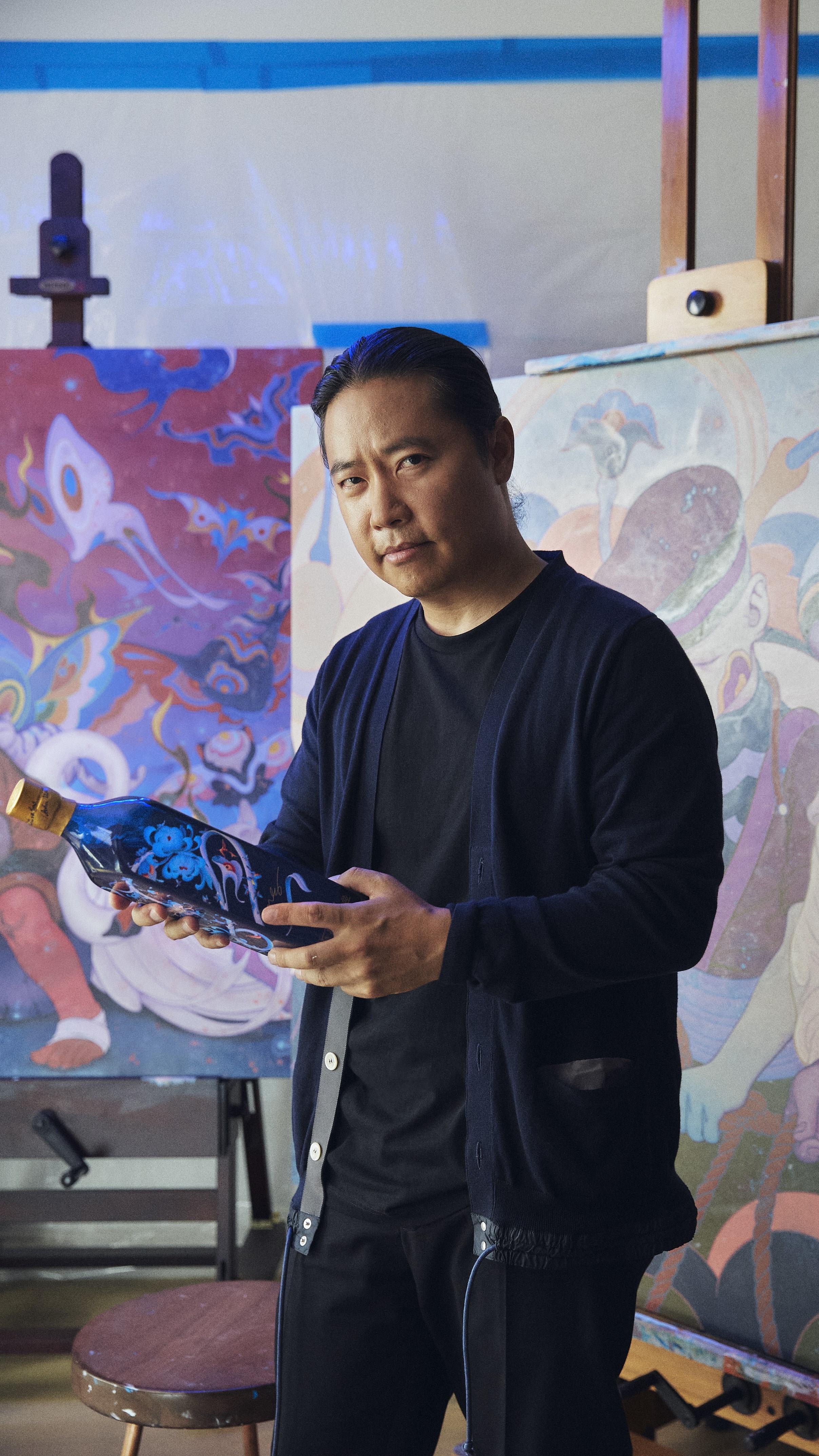
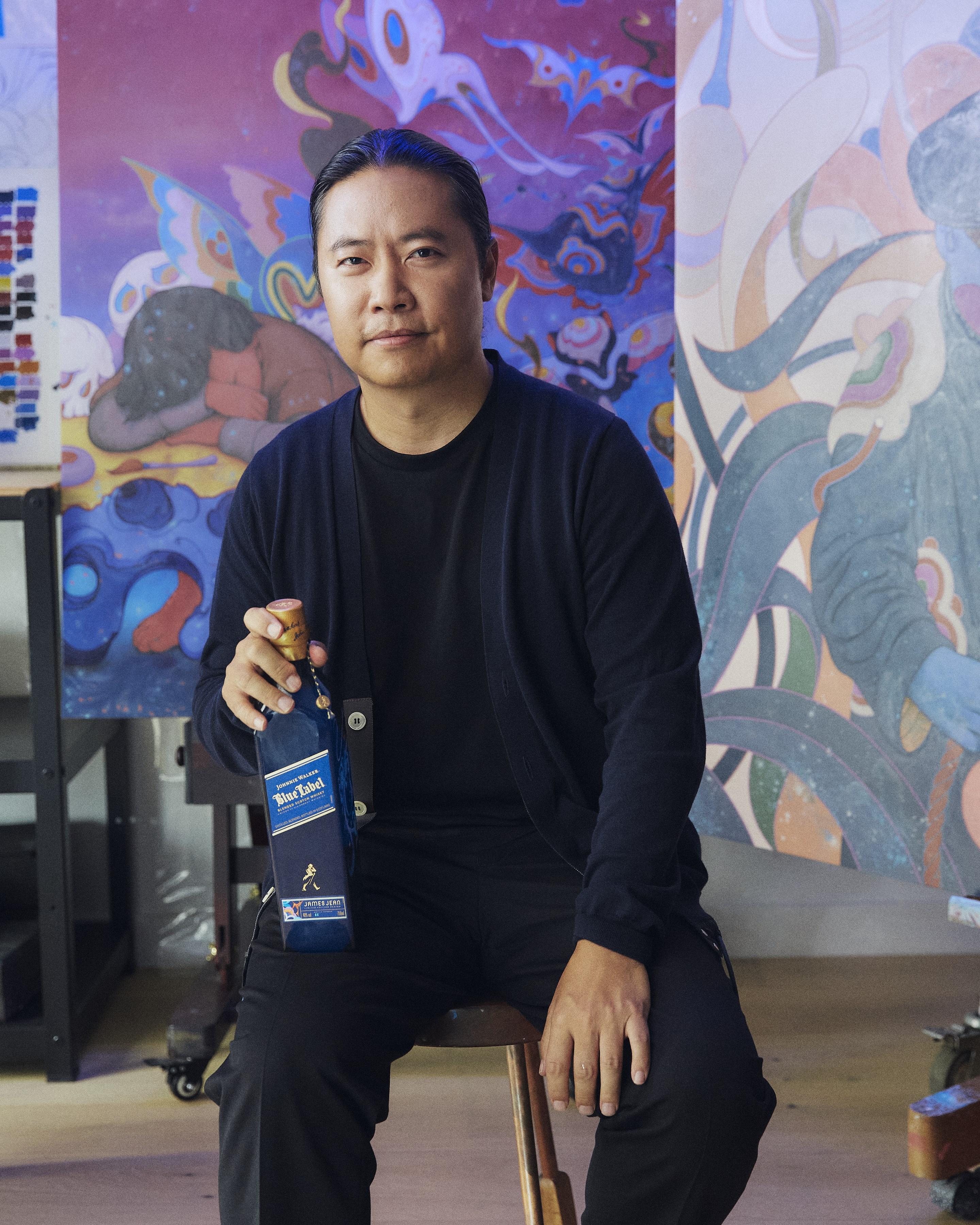
For the new Lunar year, Johnnie Walker partnered with Asian-American artist James Jean to create a bottle worthy of the Year of the Dragon. The mightiest and most respected animal in the Asian Zodiac, the Dragon is considered a potent mythical symbol of life, creativity and prosperity—making this arguably the most important year in the Lunar cycle.
Tapping Jean to illustrate the limited edition expression is telling: His intricately detailed style is a perfect decoration to adorn the bottle and packaging with. Dreamy, baroque, filled with animals, swirling flowers, and of course a gorgeously detailed Wood Dragon. According to Jean, a nod of the top-hat to the defiant optimism of Johnnie Walker’s motto, Keep Walking.
Boasting a resume bursting with bona fides—from exhibits with art-world titans like Takashi Murakami to illustrating the posters of Oscar-winning films (The Whale, Everything All At Once, Mother!,) to having his art—a poster for Guillermo del Toro’s Pinocchio—added to the permanent collection of New York’s MoMA. Simply put, one of the greatest accomplishments a young visual artist could hope for.
We had a chance to ask Jean about his come up, some of his favorite collaborations and of course, how his Johnnie Walker project came to be.
The first time we saw your work was your Zugzwang exhibit with Takashi Murakami. What was it like working with such a living giant in the art world?
Wow, you saw that show! It was in such an interesting and obscure location, hidden within the bowels of Nakano Broadway. In my experience, Takashi was extraordinarily generous with his time and thoughts about being an artist and how to exist in the art world at large.
He came to my home in Los Angeles and his team carried in a printer—a desktop printer! The notes of the meeting were then printed out on-site after the meeting was completed. It was an interesting mix of contemporary life infused with a tradition… I still have long notes and letters that he wrote me, evidence that his thoughts can barely be contained in any media.
That’s part of the mystery and beauty of drawing and making art: to allow the process to reveal
the voice within.
You have a beautifully detailed style: intricate, dreamy, esoteric. Yet other times its very traditional, simple—The Whale poster, for instance. Do you switch your style up from painting to painting, project to project, or do you find yourself sticking to one style/mood for a while?
I don’t like to repeat myself, though I find in my rapidly advancing age that certain motifs and characters tend to reappear more often these days. I do enjoy switching up various approaches to making work—there are just too many images and things I want to make. From painterly to precise, my body of work is constantly evolving, and the unknown continues to be a point of fascination.
How much of a project is finished in your head before you put pen to paper (or iPad), and how much is revealed as you work on a piece?
To be honest, none of the project is finished in my head before pen meets paper. The image starts to reveal itself as I begin sketching. It’s almost like teasing form out of nothingness as I scratch the surface, the pencil marks grasping at a vague form or idea. When I use the eraser, it’s as if I’m carving away material from a sculpture. That’s part of the mystery and beauty of drawing and making art, to allow the process to reveal the voice within. Too much conscious effort and self-awareness can lead to paralysis. For me, I try to enter a state of flow and allow the drawing to emerge on its own.
One of your most successful mediums is movie posters—you’ve created the visual 2D representation of a multitude of awarded and even Oscar-winning films. What’s it like to grow up loving and emulating these posters to now find yourself designing them?
In art school, I was looking at Polish movie posters and of course was familiar with the work of Drew Struzan. I never thought I’d actually make movie posters, but Darren Aronofsky and Guillermo del Toro reached out to me directly, and thus began my foray into this very specialized field. Narrative has always played an important role in my work, and so it felt very natural to incorporate my own interests into these various projects. I used various techniques, from digital painting to traditional charcoal drawing, to weave the narrative into a single, striking image.
Tell us just about one film poster: how the project came about, process, working with the film maker, etc.
Guillermo asked me to make the poster for Pinocchio, and I was honored and excited to contribute in any way possible, especially after doing the poster for The Shape of Water.
He told me the film was inspired by his own relationship with his father. His Pinocchio is about what it means to be a good father, a bad father, and to live in a world where parents can learn to love you for who you are. In his words, “at the heart of the film is the fusion, the dance of creation between Geppetto and Pinocchio.”
Inspired by the idea of a metaphorical dance, I wanted to show Pinocchio stepping out into the world, literally leaping out of the picture frame, and Geppetto having a hard time letting go. The characters are under the protection of the Blue Fairy who towers over the characters, her wings outstretched.
After finishing the graphite drawing, I scanned it into the computer and painted it digitally, experimenting and developing the final color palette through trial and error.
I was told that MoMA in New York would be holding a special exhibit featuring all the physical puppets and sets from Pinocchio, as well as showing a mini retrospective of Guillermo’s movies, so I created a special print to be exhibited at the museum. I hand-painted a grayscale depth map which was essentially 3D printed onto paper to create an incredibly detailed shallow relief. All the wood grain on Pinocchio is expressed in sculptural form to further emphasize the idea of an inanimate figure coming to life. The eyeballs of the fairy also protrude out and glisten in the light. And I’m extremely happy to say that this poster is in the permanent collection of MoMA.
I want my work to function from far away but reveal more details the more closely you explore
the imagery.
How did this project with Johnnie Walker come about? Who approached you, and how long did it take from that moment to agreeing to the partnership to finished product?
It was an email titled “Partnership with Johnnie Walker” that sparked my interest. Early on in my career I did a lot of commercial illustration, but then I moved to focusing on fine art. I therefore prefer to work with brands when it feels collaborative, so the word “partnership” piqued my interest.
For this project I took the energy provided by the brand and channeled it into these rough drawings. My drawings always have a lot of energy, with lots of erasing and redrawing. It’s almost like sculpting an image out of air. There’s this tangle of lines, very lyrical lines, which is what I’m known for. That type of line work is good for depicting a dragon looping in the air gracefully.
My work involves layers. It’s all about depth, technically, using traditional methods but also incorporating new media like digital tools.
Together, we wanted to create a dragon that felt different, new and innovative—respect for the past but also looking into the future with optimism; in the same way that Johnnie Walker stands for progress through that incredible “Keep Walking” spirit. There are hidden elements in the picture as well—layers to be discovered, just like the layers in this incredible whisky.
I included chrysanthemums, from which flows liquid gold—inspired by Johnnie Walker whiskies—and hummingbirds sipping on the precious nectar. I want the viewer to peel back the layers and discover more about the image. I want my work to function from far away but reveal more details the more closely you explore the imagery. The idea of growth and renewal using these natural elements is important. I wanted the dragon to feel familiar but also new in terms of how it was stylized.
What made you want to work with Johnnie Walker?
The ethos of “Keep Walking” deeply resonates within me. Beneath the superficial successes lies a litany of rejections and hardships, overcome through sheer determination. The Striding Man keeps moving forward, no matter what.
The Johnnie Walker Blue Label box is a very cool manifestation of your more intricate, fantastical style. What were the challenges with the packaging, its shape and dimensions?
My focus was to create a piece of art that could be adapted to various scenarios. This meant that everything had to be created in separate layers, which was a bit of a challenge with my work, since it tends to be intricate with the colors being quite nuanced. My photoshop files are very large, and managing all the different layers and effects can be difficult. I also must give credit to the designers, who are ultimately tasked with adapting the final artwork into multiple formats.
Lastly as an Angeleno, give a shoutout to one of your favorite small restaurants. A place you love, one of the first you hit when you get home, and your favorite dish there.
I have to shoutout my favorite area in Los Angeles, called Sawtelle. Sawtelle Blvd is packed full of restaurants, with fare ranging from ramen to tacos to boba. And it’s extremely walkable—a rarity in LA! However, if I had to single out a single restaurant, I’d have to say Otafuku. I love their sudachi soba… when sudachi lime is in season, this is such a bright, refreshing, and comforting bowl of noodles.
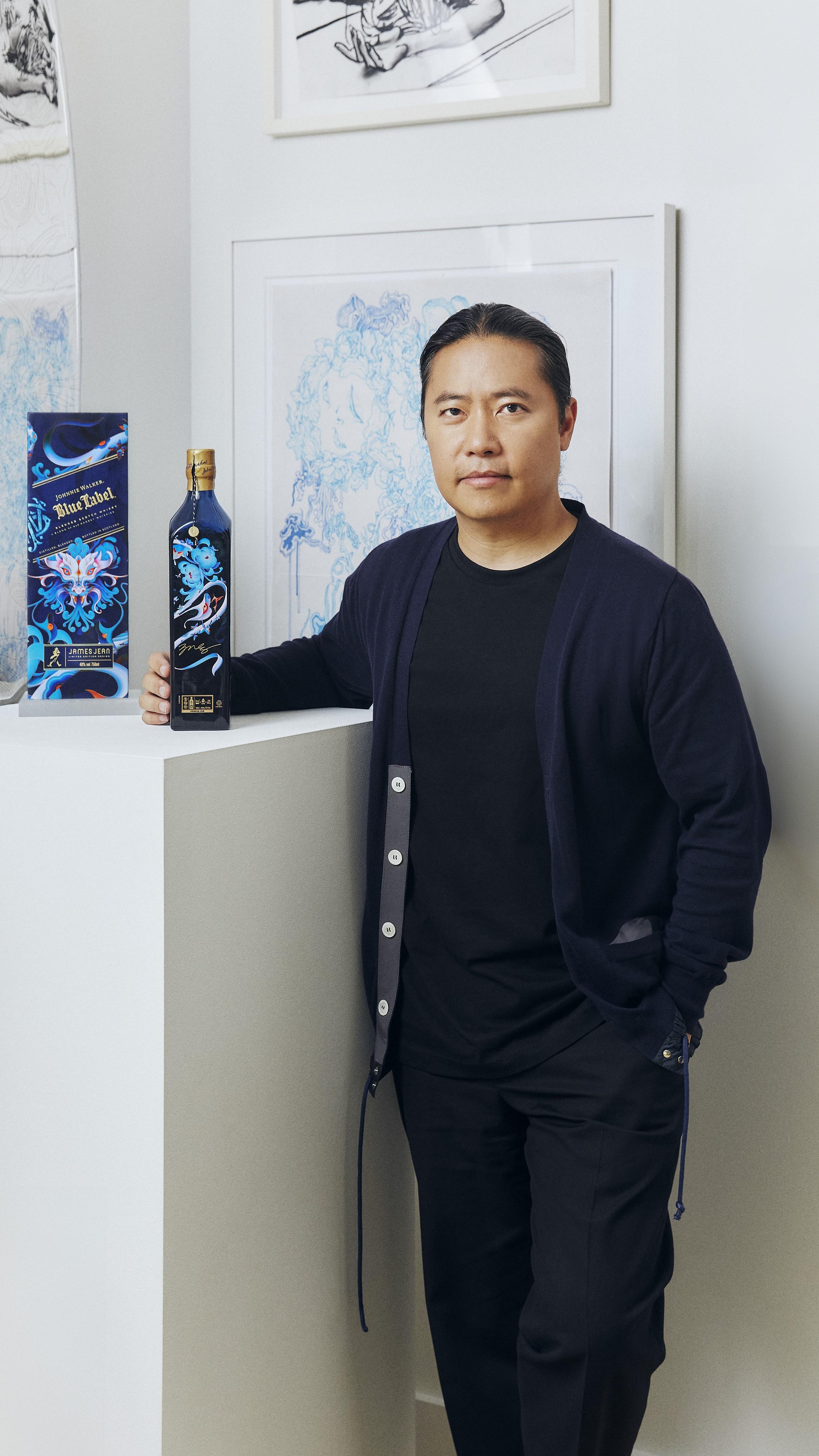
Johnnie Walker Blue Label Year of the Dragon, illustrated by Jean, comes bottled at 46% ABV with a $269 SRP.
Follow Deputy Editor Nicolas Stecher on Instagram at @nickstecher and @boozeoftheday.